
Case Study: Network2Work – Essential Resources Feature
Client: Network2Work
Employer: Tech Dynamism
Date: 2022-2023
Summary
For a web application serving job seekers, added a new feature to allow users to filter a list of resources based on specific criteria.
Context
Network2Work is an innovative program that connects low-income job seekers with wraparound services to help them attain and thrive in better-paying work.
The program uses a web application that job seekers can log into to view their “career pathway.” This shows them the various resources (services, training, etc.) that have been recommended to them to aid in their work search.
Some of the resources recommended to job seekers are considered “Essential” – for example, if the job seeker needs help with childcare or transportation in order to be able to hold down a good job, those would be essential resources.
Other resources are not essential, but recommended.
Content Need
The client (Network2Work) wanted a way for a job seeker to view all the resources that were recommended to her, but also to be able to quickly and easily see which of those resources are considered “Essential” so that she could prioritize them.
The client originally suggested changing the page which had previously listed all resources to now have three tabs:
- All Resources
- Essential Resources
- Non-Essential Resources
Process
- Discussed user context, needs, and challenges with client to develop a full understanding of what was needed and how this would help job seekers streamline their work search
- Worked with software developers and QAers to evaluate the underlying data structure of “resources” in the application, and what would be needed to create two different classifications of resource (“Essential” and “Non-Essential”)
- Evaluated impacts of this change on other areas of the application
- Worked with a UI designer to explore different ways of redesigning the career pathway to let job seekers quickly and easily filter to see only “Essential” resources; suggested a simpler and clearer approach instead of the requested 3 tabs
- Reviewed designs and reasoning with client, and also discussed impacts of this change throughout the application
- Outlined, mapped, and wrote user stories in consultation with the team; included designs and detailed acceptance criteria; noted dependencies and cross-referenced related user stories
Outcome/Impact
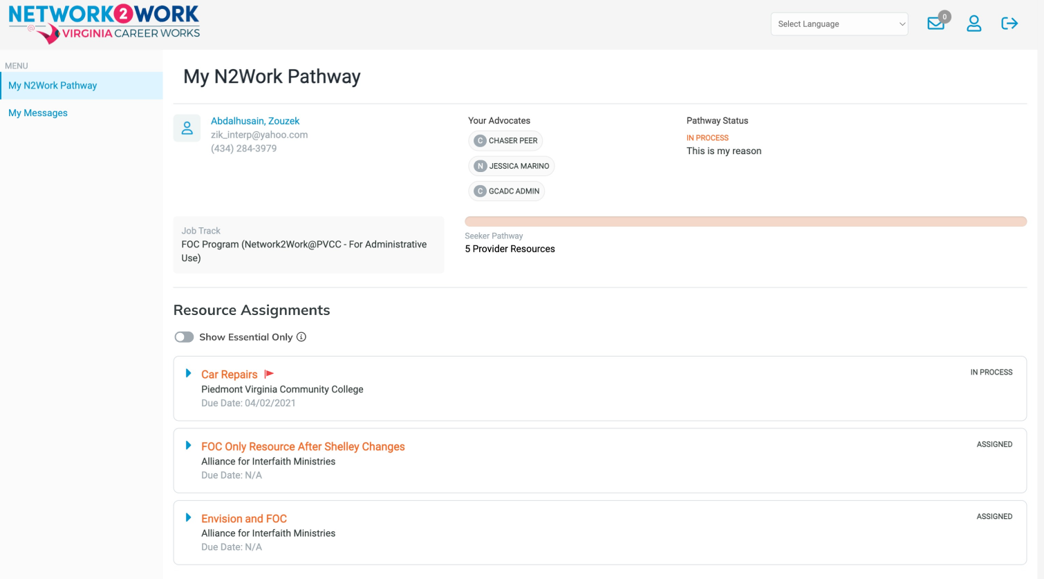
Based on my design suggestion, the final page design was simpler than what the client originally asked for (three separate tabs).
Since I assessed that job seekers would either want to see (a) ALL resources, or (b) only Essential ones, I suggested we simply put a filter on the page using a toggle switch
- Because the concept of an “Essential Resource” was new for users, we included a tooltip on the toggle to explain why the user might want to view only Essential Resources.
- We also put a “red flag” icon on all Essential Resources so they would stand out visually anywhere a list of all resources appeared.
